E-commerce
User research and information architecture-centered design that brings e-commerce to a local, family-owned business.
Overview
Brigg’s Garden & Home offers a variety of home decor, gardening supplies, outdoor furniture, and plants to meet their customer’s various needs. The only way to browse the shop’s merchandise is to visit the physical location. Their online presence leaves a lot to be desired, like the ability to purchase your favorite items. Thus, the goal of this exploratory solo project is to create an e-commerce experience for them.
Details
Client: Brigg’s Garden & Home— concept design
Duration: 2-week sprint
My Role(s): UX Researcher, UX Designer, UI Designer
Tools: Miro, OptimalSort, Figma, Google Drive, Zoom
Process
Research: Understanding our users
Define: User personas & problem statement
Ideate: Designing potential solutions
Usability tests: Test, iterate, repeat
Solution: New e-commerce site

1. Research: Understanding our users
In the initial phase of the design process, I conducted user research including: user interviews, competitive/comparative analyses, and card sorting studies to learn about user behaviors, goals, and pain points.
What are users saying?
4/5 users seek out plant care information
3/5 users do not have the time to take care of high-maintenance plants
4/5 users prefer to purchase various items in one transaction
Affinity map of user insights
Where are users shopping?
I analyzed features from The Sill, Bloomscape, and Niche Plant Shop, which were identified as competitors during user interviews. I highlighted the features that existed on all 3 sites to serve as the basis of my design.
Comparative feature analysis

How are users classifying products?
Brigg’s Garden & Home carries a countless assortment of decorative home items, gardening accessories, and gifts. I created a representative inventory with 100 of their items to design open and closed card sorting studies. Thereafter, I analyzed the results of the studies to design the information architecture of this new e-commerce site.
Card sorting study
I recruited a total of 21 participants to engage in open and closed card sorting activities to design the information architecture of this new e-commerce feature.
Card sorting study with 100 items
Sitemap
After synthesizing the results of the card sorting studies, I created a hierarchical diagram of the new e-commerce site. This sitemap shows how pages are prioritized, linked, and categorized.
Sitemap of new e-commerce site

2. Define: User personas & problem statement
From interviewing 5 users who shop at home and garden stores online and in-person, I developed a primary (left) and secondary (right) personas. These personas represent the different types of users that would use this e-commerce site.
Primary Persona
Secondary Persona
Problem statement
Ivan wants a way to purchase plants and learn about how to care for them, so he can spend more time enjoying his plants rather than researching them.

3. Ideate: Designing potential solutions
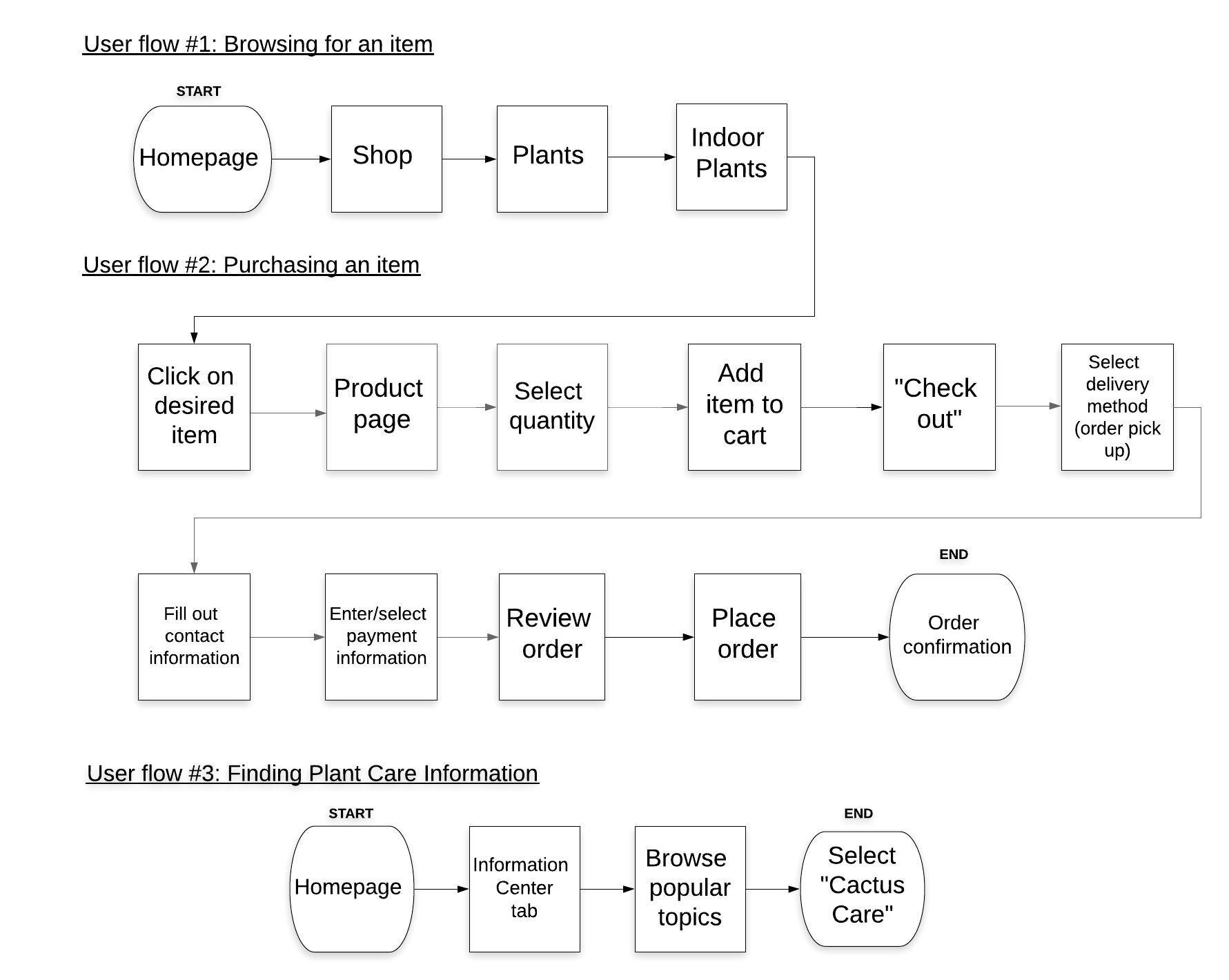
In this phase, I utilized the user research to design user flows and sketch out solutions for my personas.
User flows
After conducting user research and creating a persona that embodied the research findings, I began thinking about the different tasks this persona needs to complete to solve their problem and what that journey would look like.
From there, I defined three user flows: Product discovery, checkout, and plant care information.

4. Usability tests: Test, iterate, repeat
Throughout the design phase, I conducted three rounds of usability tests at low- , mid- , and high-fidelity stages. Feedback from potential users was applied to strengthen the e-commerce experience.
Usability Test #1: Sketches
• Product gallery: Add “size” and “color” filter
• Product page: Add 3+ product pictures
• Checkout: Separate stages
Usability Test #2: Mid-fi wireframes
• Product page: Add arrows to sides of images
• Fill form: Increase text size
• Billing: Add form for credit card info
Usability Test #3: Hi-fi wireframes
• Shop categories: Increase font size 14 to 18
• Breadcrumbs: Missing item in sequence
• Billing: Increase spacing on form

5. Solution: New e-commerce site
Brigg’s Garden and Home’s new e-commerce site that provides an easy browsing and shopping experience with access to plant care information.

Through this experience, I learned to…
Organize & Synthesize.
Each user offers crucial, specific insights that are unique to them and their experiences. When looking at user interview transcripts and notes, it can be overwhelming. Utilizing methods such as affinity mapping was so important in organizing and synthesizing all that information.
Test. Iterate. Repeat.
It was crucial to receive feedback during each stage of the design process. After working on the same screens for lengths of time, I found that I would miss minute details that users would point out during usability testing. My designs would not be what they are without such important feedback.


